
 Click here to access the related GitHub repository
Count your reps
Fitness training generates data in many different ways. From measuring your heart rate or number of steps, to estimating the number of calories expended or the power generated or something simpler as the number of repetitions, sets or the weights lifted, there are many ways of generating, measuring and analyzing data about your body and its performance while exercising. Many instruments and gadgets have capitalize on this, giving you access live to this data and some apps and websited now even build and train model to provide their users with a customized, tailor-made workout plan. There is no denying it: fitness workouts are a numbers game.
There is no denying it: fitness workouts are a numbers game.
The LesMills BODYPUMP™ fitness program
LesMills is a company, originally from New Zealand, designing various types of fitness programs (cardio, HIIT, strength, yoga, etc.) taught by instructors in gyms all over the world in the form of group classes. BODYPUMP™ is one of those programs. Usually in a 55mn class format, it focuses on low-weights/high-repetitions workouts, using a light barbell and some weight plates to develop, reinforce and tone all of the main muscle groups of the body (legs, back, chest, arms, shoulders, core). What makes it special? The workout is divided in 10 tracks (including a warm-up and a cool-down) of 5-6mn each where the participants follow a choregraphy synced to music. The choregraphy involves a variety of moves working the muscles in different ways and tempos making the exercise more varied and less repetitive. The music along with the instructor make the workouts more engaging. Finally, every 3 months, the design team of LesMills licenses 10 new music tracks and designs a brand new set of moves and combinations and releases it to the licensed instructors accross the world so they can learn these new choregraphies before bringing them to their members in their regularly scheduled classes. This helps to keep the program fresh while keeping a certain level of standards.
My personal LesMills BODYPUMP™ journey
I first walked in a LesMills class about 10 years ago, in 2015, while visiting friends in Belgium. They brought me to their BODYATTACK™ class another program of the same group, this one focusing HIIT cardio. I struggled to even finish the class... But I was hooked. Coming back home, I looked for a gym teaching LesMills program and immediately started joining BODYATTACK™, BODYCOMBAT™ (another cardio class, inspired by martial arts moves) and BODYPUMP™ classes. Fast forward to 2021, after moving to Hong Kong and looking for a new personal challenge I decided to become a BODYPUMP™ instructor, passing the certification program (involving an initial training, a mentoring program and a final exam). Since then I've been teaching classes at gyms in Hong Kong and now have 3 weekly regular classes.
Data and project motivation
As mentioned before, there is a lot of interesting data generated around fitness in general and the BODYPUMP™ program. I could be writing about heart rate, fitness level, the weights used, etc. Instead I chose to focus on the program itself. See, with 10 new tracks being released every 3 months, LesMills does a good job at keeping the program consistent as well as keeping it fresh, evolving and up to the latest trends. And not only, is it 10 new songs but also 10 new choregraphies. Now, once again the structure does not change, and so track 2 is always going to be squats, track 5 biceps etc., and there are only so many different moves and ways to train a muscle group with weights. Still, I (and most instructors would confirm) and the feeling that some releases (ie. set of tracks released every quarter) felt harder or easier that others. This could be due to the tempo of the song being faster or slower, the frequency or just number of repetitions, or the intrinsic difficulty of the moves and combos in the choregraphies. Therefore, the project goal is about capturing and trying to objectify as much as possible differences in levels of difficulty between releases.
The project goal is about capturing and trying to objectify as much as possible differences in levels of difficulty between releases.
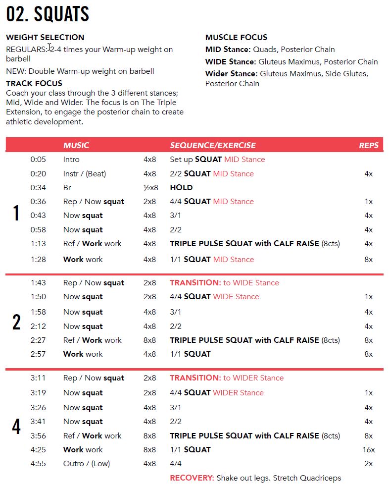
Source of data: the BODYPUMP™ choregraphy notes
I went looking for datasets on BODYPUMP™ tracks, trying to obtain a neatly organized set of moves, repetitions (reps) and timings for as many tracks as possible but could not find any. I was going to have to create by own. As an instructor, you have to purchase your own music released and licensed by LesMills on a platform to be able to use it in your classes. The songs also come with choregraphy notes, teaching the instructors all they need to know about the sequnce, moves, timings (or tempos), number of repetitions and combinations (or combos). These documents generally follow the same format (though not always) meaning it would be possible to capture and extract data from them and store them in a tabular format.
Methods
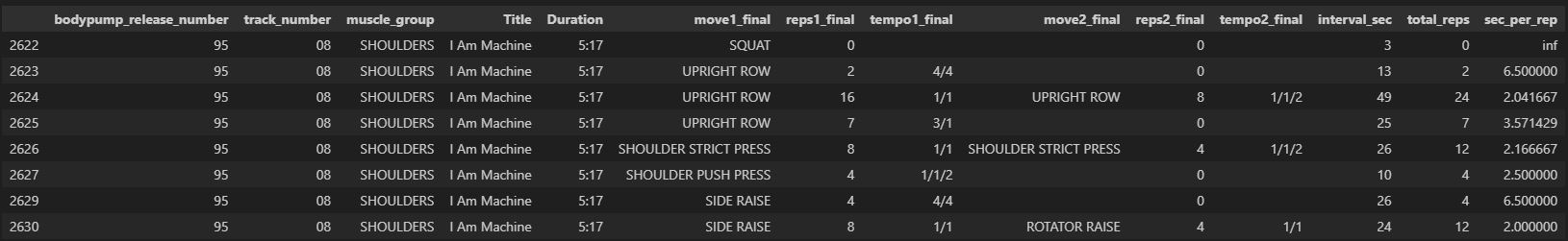
The first part of the Jupyter Notebook available on the GitHub repository linked above focuses on doing just that. Using 19 different choregraphy notes (from releases ranging from #94 to #127), I wrote functions reading the pdf documents page by page and pulling out only the information about the choregraphies (there are also notes and comments addressed to the instructors). More specifically, I set out to extract for each track:
- the metadata about the track: release number, track title, track number, muscle group, track duration;
- for each move in the track: move description, number of repetitions, tempo, time index.
Adding personal information
While the data obtained above enables an objective comparison between tracks, I was also
interested to add some personal touches.
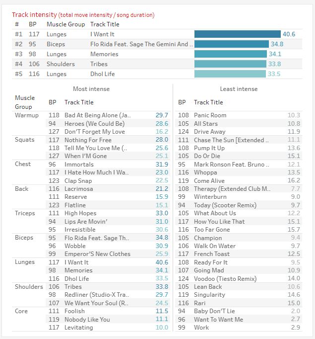
First, I added my own intensity ratings to be able to
compare tracks having different moves. Taking the triceps tracks for example, the issue
is how
to compare a track that has mostly triceps extensions with a bar or a plate, with one
that
has mostly kickbacks or one that is a mix of triceps pushups and dips? It is just not
possible.
Now, while the intensity ratings are obviously a personal perception and classification
of intensity, they do allow for such comparisons. On the repository, the file
'move_intensity_assignment_v1.csv' shows the values chosen
between 0 (lowest intensity) to 100 (highest). For example a triceps dip with a 2/2
tempo has an
intensity of 50, while a triceps pushup 1/1 gets a rating of 70 and a triceps press 4/4
gets just 25.
Second, I keep track of the list of songs I teach in every class. I call such lists
'mixes' as I mix tracks from different release to create the
playlist for a certain class. Combining this with a system of track IDs, I am able to
join such data with the data mentioned before to calculate
intensity for my different mixes and compare them.
Third, I usually wear (and remember to start...) a sports watch while teaching my
classes. I was able to access my fitness data captured by Polar
and, using the workout dates of my different mixes on one side, and of the training sessions on
the side, cross join fitness data
measurements to the mixes data described above. Training load, maximum and average heart rate
are therefore able to be used in
conjunction with the repetitions and intensity data of the corresponding tracks and workout
sessions calculated before.
Results and dashboard presentation
After compiling the data and generating csv files to use as datasources, I was able to present the results of my findings as a Tableau dashboard. The dashboard is possible to view on Tableau public, or by downloading the file directly from the repository.
01- Track overall comparison
This first sheet (broken down in two for ease of read) compares tracks accross 4 different simple metrics, overall, and within each muscle group:- Track duration: just the longest and shortest tracks overall and per muscle group. Most tracks average 5 minutes but the longest one I have access to is the 6:27 long back track from release #124 "Won't Make A Sound".
- Number of reps: the total count of reps (included, but indicated separately, pulses) in each track. It's not rare for a whole Bodypump workout to total 1000 reps. The lunges track from release #117 "I Want It" is 216 reps, largely due to the high number of pulses (192), reps of lower range.
- Track speed: this metric is calculated by dividing the length of the track (in seconds) by the number of reps. This means that tracks with a high track speed have a lot of reps comparatively to the length of the track. I found this metric interesting as some track may be have more reps than others but eventually have the same number of reps or even lower, making them "less intense". For example, the biceps track of release #95 "GDFR" is only 4:25. But it has 154 reps in that time, making it actually the "fastest" biceps track with 1.72 sec per rep (or 1 rep every 1.72 sec).
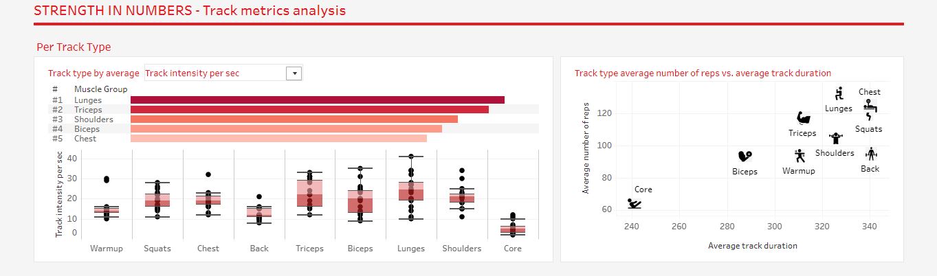
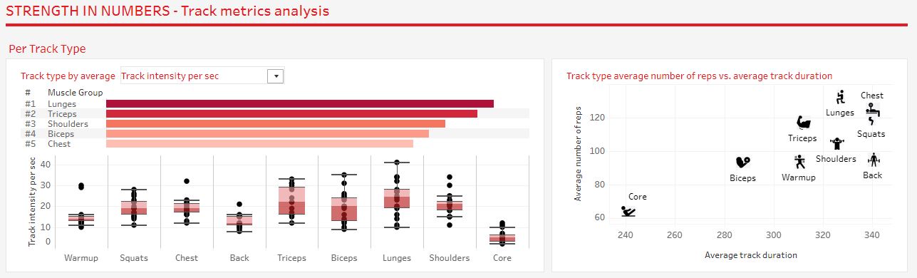
02- Track metrics analysis
This second sheet lets the user compare tracks, either by track type or by release, according to the metrics described before. By default, the metric chosen is the track intensity per second, but others can be selected.
- Per Track Type: based on this metric, we can see than Lunges and triceps have the highest intensity. Most Bodypump instructors or members would confirm that! The top right scatter plot shows that Chest and Lunges tracks have actually the highest number of reps, though lunges track being usually a bit shorter, it makes them more intense.
- Per BodyPump release: the comparison of the average for this metric is more difficult, but overall it sometimes feel like most tracks from specific release felt harder. Bodypump #96, #117 and #118 seem to be in that case. On the right we can see that Bodypump #116, the one I have actually passed my certification on and I consider as one of the "easiest", has tracks generally shorter and with fewer reps.
- All tracks: the bottom two scatterplots are showing all the tracks in the dataset and are therefore better used by mousing over some of the outlier data points. I also wanted to confront my own perception of the difficulty (rating out of 10) to the actually calculated intensity as described before. The correlation is not obvious but there is a slight positive correlation.
03- Moves analysis
This third sheet goes down to the actual moves breakdown. Over all the releases, the BodyPump choregraphies include many variations of the same "move". A standing triceps extension is not exactly the same as a sitting one, a wide pushup engages chest muscles a bit differently compared to a mid-grip one. However, for the sake of comparison, I've combined and grouped some of the moves under a fixed list of move types.
- Overall: this chart shows the top 10 most popular move types. Unsurprisingly, these are the usual suspects: squats, chest presses, pushups, lunges, deadrows... These moves are colored on the rest of the page, meaning that the non-colored ones (in grey) are moves outside of this "top 10".
- Per track type: the goal of this selectable histogram is to show on average, how many reps of each move types are done. We can see for example that the most popular move in the triceps track is the triceps overhead extension (~39 reps in a track), with triceps kickback and triceps press close behind. Chest tracks mostly consist in chest presses and pushups and biceps tracks of biceps curls. Shoulders tracks are more diverse in moves, sometimes including strict presses, sometimes involving pushups and upright rows, sometimes using side raises.
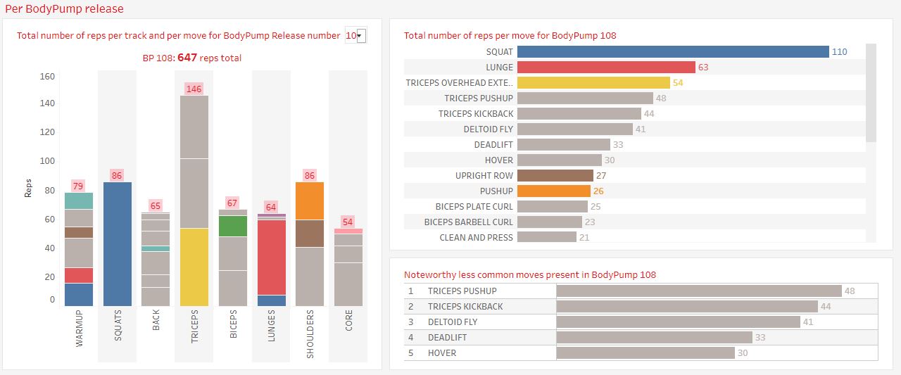
- Per BodyPump release: here I was interested in showing the distribution of these popular moves per release. If we look at release #108 (see below), we see that while the Squat and Lunges tracks are very "conventional" with mostly just squats and lunges, the triceps track is more "original" than the average one, using triceps pushups and triceps kickbacks for two thirds of the reps. The shoulders track also involves deltoid fly for half of it.
04- Make your own mix
In this sheet I wanted to showcase my dashboard building skills by bringing some interaction with the user. If you are an instructor and you want to use it to build your own mix of tracks for your next class, he is how I intended it:
- Select the metric you want to focus on for the track selection. Maybe you want to maximize (or minimize) intensity. Or the number of reps. Select this at the top.
- For each track type, a bar chart displays the list of available tracks, ordered by the metric you selected. You can select a track for each track type, using the drop downs and it will highlight it in orange.
- Once you've selected all your tracks, an indicator on the right confirms it and shows for how many of them the data about the reps is available.
- The next multiple bar chart gives an overview of the tracks selected, with 3 different metrics for each track. You can select and change the metrics displayed.
- Finally, the last part shows the brekdown of the moves, both per track and the overall total.
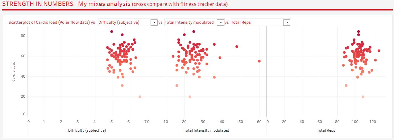
05- My mixes analysis
This last worksheet brings in the fitness data measured by my Polar watch like I mentioned it
before. I'm focusing here on a metric called "Cardio Load"
which is an aggregated score calculated by Polar for each workout session (based on duration,
average and max heart rate, and time spent in the 5
different cardio zones). I wanted to see if there is a correlation between higher cardio loads
and the metrics discussed before to "objectivize"
the difficulty of the songs and mixes. I am comparing the cardio load (y-axis) to my own
perceived subjective difficulty rating (out of 10, first x-axis),
the average intensity per second per song (second x-axis) and the average number of reps per
track (third x-axis). The scatter plots do not really
show any obvious correlation though a faint upward trend can be observed. But for example, the
"hardest" training session, on 2024/07/20, only scores a 5.0
on my subjective difficulty ranking and is also on the lower end for the intensity metric. In
the upper half of intense workouts, the one with most reps
had a total of over 1000 reps!
These observations obviously need to be tempered by the fact many other factors can
influence the heart rate and cardio load measured. The watch
itself, not as accurate as other devices, the form of the day, how much sleep I had the night
before, the weight on the bar... Consider this more as a
thought exercise than a real consluive analysis!
Conclusion and lessons learned
The lack of organized data about BodyPump track instructions ended up causing difficulties
and challenges to extract and create such
data for the task. The uneven presentation of the choregraphy notes, making the use of
custom functions unreliable, added even more complexity.
Once extracted, standardizing the names and presentation proved to be another difficult task
while necessary to be able to make any analytical
comparison. Finally, some of the metrics used or crafted (difficulty, intensity) are
subjective and therefore only make sense in the context of
my own analysis. The observations derived from the comparison of tracks is therefore to be
taken with this in mind.
But while objective comparison was not really possible (and a difficult goal set at the
start), this project still enabled me to learn and
practice a lot of tools. Custom function writing for the reading and extraction of
non-tabular data from pdf documents was particularly challenging.
Standardization and metrics definition was another challenge. Finally, the
presentation of my findings as an interactive
Tableau dashboard was a good opportunity to showcase my data visualization skills.
In the end, whether or not some BodyPump tracks are harder than others is mostly
subjective and personal and will also depend
on other external factors. Except for #106 Lunges "I Need A Miracle", which is pure torture.
The most important, is that BodyPump workouts create conditions to let you work out to the
fatigue point all the
while using light weights that non-gym people will feel more comfortable with. And that is
the true essence and success of BodyPump.
BodyPump workouts create conditions to let you work out to the fatigue point all the while using light weights that non-gym people will feel more comfortable with. And that is the true essence and success of BodyPump.