 Click here to access the related GitHub repository
Introduction
For my first time experimenting with a Kaggle playground series competition, I wanted to build a simple model and use a simple dataset, to apply skills I have learned in online courses on DataCamp, or even more recently, completing the Google Data Analytics certificate on Coursera. Therefore I recommend anyone wanting to apply skills learned from theoretical classes to try and play around with the Kaggle Playground Series. This project will be a detailed presentation of the step by step analysis and model building. The complete Jupyter Notebook can be accessed here.
1. Project
1.1. Data
The data is available on Kaggle as part of the March 2025 Kaggle Playground Series competition.
We
are provided with a sample csv file for submission (see 1.2. Objective), and a dataset already
split between a 'train' (with the target metric) and a 'test' (without the target metric).The
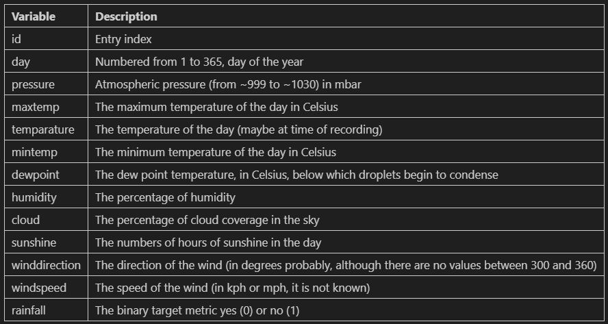
data consists of calendar and meteorological data. There is no extra information about what they
mean exactly. Here are the 13 fields, with my best guess as to what they represent:
1.2. Objective
The objective of the project and model is to predict whether or not there is rainfall for each day of the 'test' csv file. More specfically, we are to predict the probability of rain as well. This means that we will be looking to not only focus on the binary result (rainfall/no rainfall) but also on the probability in between 0 and 1. Therefore, we probably will not favor a metric like precision, recall or accuracy above any other, but rather try to get a high f1-score.
1.3. Plan
Since this is a binary regression problem we have two main possible avenue of modelling here: a logisitic regression model, and a decision-tree based model (decision tree and random forest). However, since we are also required to provide probabilities for the target metric 'rainfall', we will focus on a logisitic regression model as a limitation of decision tree-based models is their capability to provide probability estimates.
2. Dataset exploration
2.1. Data import
First we import the main libraries (pandas, seaborn, matplotlib, sklearn) and tools we need for the project. Then we also import and load separately the train and test csv files.
2.2. Initial data exploration and cleaning
Next, we will:
- look to understand the variables
- check and correct the datatypes
- rename the columns
- check for missing values
- check for duplicates
- check for outliers
- check the target label distribution
The data looks to be in the same format for both the train and test datesets. The data types look correct and there does not appear to be any missing values except for one entry of winddirection in the test dataset. The train data covers 6 years, while the test one covers 2.
There are no missing values except for on entry of winddirection in the test dataset. We could assume it was because there was no wind on that day. How every the data shows windspeed = 17.2 on that day. We could drop the row, however we are tasked to present the rainfall probability for every single day in the test dataset. We have a few options to inpute the missing value (which might not even matter if we don't use winddirection in our model). Imputing with the mode, or most common winddirection, would make sense. The value is 70. However, it seems that at this time of the year, the most common wind direction is 220 degrees. We will therefore impute and replace the missing value for winddirection in the test dataset with the value 220.
For a more rigorous approach of outliers consideration we combine both the training and testing data and "flag" the outliers corresponding to either the train dataset or the test one. We get the representation below.
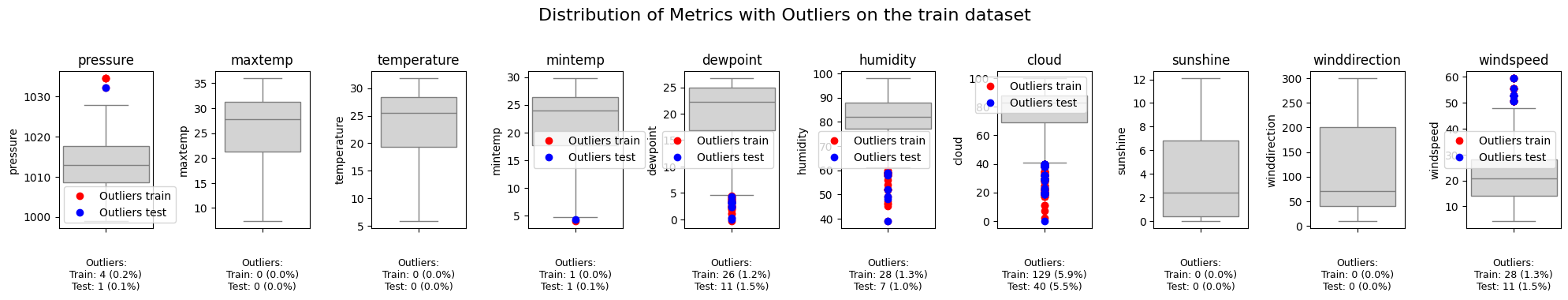
As we can see there are quite a few outliers especially for the cloud metric. We will need to
consider if we drop it or modify when we actually build our model since some models perform
considerably worse with outliers. Another observation is that there is no disproportionate
representation of outliers in the train or in the test dataset, meaning the sets were most
likely separated randomly instead of any engineered or deliberate split.
Finally let's check the distribution of the target label 'rainfall' 0 or 1 to see if there
is an over-representation of one of the two classes. We have about 3 times as many entries for
rainfall (1) than no rainfall (0) with a 75-25 split. However, that is not enough to qualify
this dataset as skewed or inbalanced.
2.3. Advanced data exploration
Next we are going to create a number of visualizations to appreciate the distribution of the data
and maybe draw some early observations as to what might influence rainfall or not. We will now
focus on out train dataset since it is the one we will use for model building. We will also
assess for multicolinearity, as it is a prerequisite (to avoid!) for model building. Finally we
will get some ideas for feature engineering.
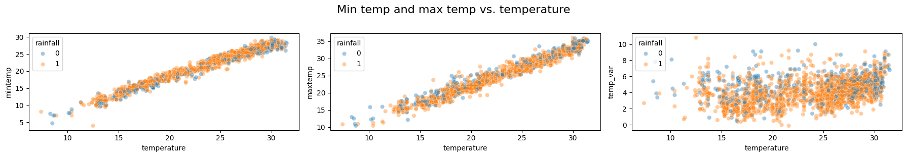
Mintemp, temperature and maxtemp:
- As we can see, mintemp, maxtemp and temperature seem to be highly positively correlated. We will likely not need to keep all three metrics. Furthermore, the distribution of the rainfall labels seems to be pretty uniform accross all possible temperatures, not leading to any conclusion of any obvious impact of the temperature on rainfall.
- A potentially interesting metric, the temperature change or total temperature delta during any given day (max minus min) does not seem to be correlated with the temperature. However, there also does not appear to be any obvious impact of this metric over the target metric.
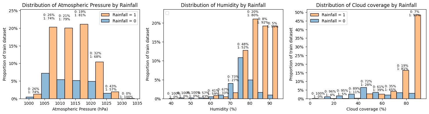
Humidity, pressure and cloud coverage:
- The 'pressure' histogram above shows that the data is generally normally distributed. There also does not seem to be any obvious link between pressure and rainfall though the comparative percentage do seem to change a little at high pressures, with rainfall being comparatively less frequent at higher pressures (but there are also fewer data points).
- The humidity histogram show data skewed towards higher values of humidity. There also seem to be a correlation between higher values of humidity and increased chance of rainfall.
- Likewise, the cloud histogram show data skewed towards higher values of cloud coverage and there also seem to be a correlation between higher values of cloud coverage and increased chance of rainfall.
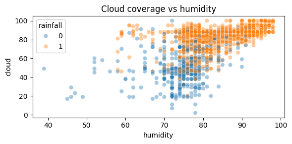
As shown on the scatterplot above, the correlation between cloud coverage and humidity is not strong but it is present, with higher values of humidity concurring with higher values of cloud coverage. As discussed before such higher value also seem to correlate with increased chance of rainfall.
Sunshine, Dewpoint, Windspeed and Winddirection
Let's build similar histograms for those 4 metrics that might have a less obvious
correlation with rainfall.
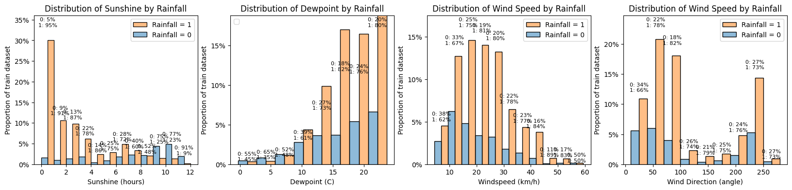
- Sunshine: as expected a lower amount of sunshine hours is correlated with a higher chance of rainfall. We will look below at the correlation between sunshine and cloud coverage.
- Dewpoint: the distribution of dewpoint is not normal but skewed to the right. Here we see there does not look to be any obvious correlation with rainfall though lower values of dewpoint seem to reduce the chance of rainfall (but there are fewer entries)
- Windspeed: the distribtuion is close to being normal though slightly skewed to the left. Here again, the correlation with rainfall is not obvious though stronger winds seem to increase the chance of rainfall. We could look to engineer a binary or categorical (and ordinal) feature with wind strength, taking example from the Beaufort scale (eg. light breeze for 6-11 km/h, moderate for 20-28 km/h etc.)
- Winddirection: the distribution is far from normal and it makes sense as we would expect the wind is mostly coming from some principal directions. We could reclassify the values in a categorical (but non-ordinal) feature with for example mostly east, mostly north, etc. However the proportions of rainfall do not seem to be correlated with wind direction.
Wind - categorical approach:
Let's create categorical variables to deal with wind speed and direction. The highest windspeed
is 59.5 km/h. According to the Beaufort scale, that is category 7 "moderate gale". Instead of
creating 8 categories we can simplify a bit and arbitrarily create 4: 1 for under 5 km/h (cat 0
and 1 in Beaufort scale), 2 for 6-19 km/h, 3 for 20-38 km/h and 4 for 39-61 km/h.
For winddirection, we could create also 8 categories (N, NE, E, etc.) but will simplify and
create 4: North (0) (0-45 and 315-360), East (1) (45-135), South (2) (135-225), West (3)
(225-315).
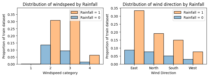
Converting continuous measures to categorical discrete ones can help to reduce the noise and
draw better conclusions. Here we can see that:
- the windspeed does seem to be correlated with rainfall, with stronger category winds being correlated with higher probabilities of rainfall
- the wind direction does not seem to have much impact on the rainfall, with the proportions being very similar for dominant wind direction. The rainfall chance is slightly increased for easterly winds.
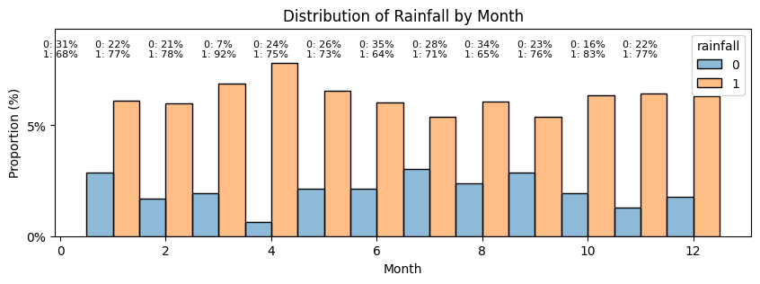
Day:
Finally let's have a look at the dates. It is unlikely that there is more and less chance of
rainfall depending on the day of the week. But it seems intuitive, even though we don't we don't
know where the data was sampled, that there would be months of the year that are more prone to
rainfall. Since there are 365 days in our dataset, we can assume day 1 is Jan 1st and can
re-classify the days in months.
Correlation matrix:
We plot a final correlation matrix to analyse the different metrics we have and summarize.
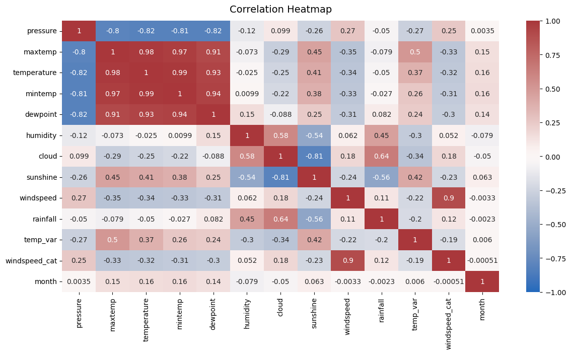
Insights:
- As discussed before, some of the metrics are correlated with on another: maxtemp, temperature, mintemp and dewpoint are all strongly correlated. To simplify the model we will likely only keep one feature of this group of 4.
- Pressure is also strongly negatively correlated with this group of 4. We could look to drop it but for explanatory purposes, it could make sense to keep it.
- There is also some moderate correlation between temperatures and sunshine though it is less strong.
- As observed before, cloud coverage and humidy are moderately correlated. Sunshine and cloud are strongly (negatively) correlated. To simplify the model, we could look to keep one of the two. As cloud a marginally stronger correlation with rainfall than sunshine does, we could keep cloud. For explanatory purposes we could also look to keep both.
- Obviously, windspeed_cat and windiection cat have strong correlation with the corresponding continuous variables. We will keep the engineered features.
- Finally, looking at potentially strong predictors correlated with rainfall (among continuous variables), humidity, cloud and sunshine seem to be by far the strongest ones. We will keep all 3. Pressure, temperature and wind parameters seem to have a lesser correlation. We will simplify there.
2.4. Feature selection
Before moving on to the modelling phase we need to select our final set of features and replicate the engineered features on our test dataset. We will keep the following set:
- 'pressure'
- 'temperature'
- 'humidity'
- 'cloud'
- 'sunshine'
- 'temp_var'
- 'windspeed_cat'
- 'winddirection_cat'
- 'month'
2.5. Outliers treatment
Since we are using a logistic regression model and it is quite sensitive to outiliers wwe will need to remove the outliers. We need to check the outliers over the overall dataset though, not just the train one, but of course, we will only remove the outliers in the train section. We need to remove rows in the train dataset that have outliers in any of the columns. That means the 'pressure', 'humidity', 'cloud' and 'temp_var' columns. We will keep this train dataset separately and try to train a model with the two dataframes, with and without outliers, and see how they perform.
2.6. Encoding
Next, we need to encode the non-numeric metrics. It's only windspeed_cat (which is ordinal, so it can stay like this) and winddirection_cat, which needs to be encoded as it is not ordinal. And we need to apply this encoding to the test dataset as well.
3. Model fitting
We are now (almost) ready to fit models. We have already a training and a testing dataset that are split. However, we will want to validate and calculate our model performance so we will further split our training dataset into a training and a validation dataset that we will hold out for performance evaluation.
3.1. Data scaling
The last stage before fitting models to finish preprocessing the data is to scale the fields. Pressure, temperature, humidity all have values on very different scales. Although scaling is not absolutely necessary when fitting a Logistic Regression model, it is still recommended.We will use StandardScaler as it is often the preferred choice for Logistic Regression as it centers the features at 0 and scales them to unit variance. We could also have used MinMaxScaler. We do need to be careful with two things:
- the scaler fitted to the train the data should then be applied identically to the test data
- the ordinal metrics, windspeed_cat and month, does not need to be scaled
- X_final, y and df_test for the model that includes all training data (with outliers)
- X_final_no_outliers, y_no_outliers, df_test_no_outliers for the model without outliers
3.2. Train/validation splits
We further split X_final, y on one hand and X_final_no_outliers, y_no_outliers on the other hand to have a train dataset and validation dataset.3.3. Cross validation for regularization
Lastly, regularization can help prevent overfitting for the logistic regression model. We have two options:- L1 (or Lasso): can be used but tends to provide sparse models. It can be useful when try to perform feature selection and identifying the most important features.
- L2 (or Ridge): is more commonly used for Logistic Regression as it adds a penalty term proportional to the square of the model coefficients.
3.4. Model fitting and evaluation
We fit the models and generate a table to compare the results using both the data with and without outliers. This is the results table we get: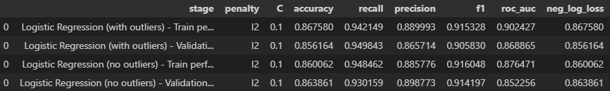
Looking at the results above we can see that:
- in both cases the validation scores are slightly lower than the testing ones. Only slightly though, so there is no need to worry
- there is no significant difference between using the dataset with outliers or the one without. The neg_log_loss is acutally slightly lower (so better) with the outliers and so is the roc_auc score.
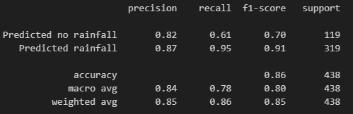
The confusion matrix shows that the model does seem to predict quite a few false positives (47 days where it did not rain but was predicted to rain) but considerably less false negatives (16 days where it was predicted to rain but it didn't) considering the split of the data being 75%-25% rainfall days vs. non-rainfall days. The model seems to be pretty good at predicting rainfall but less so as predicting no rainfall. Let's confirm that with the classification report.
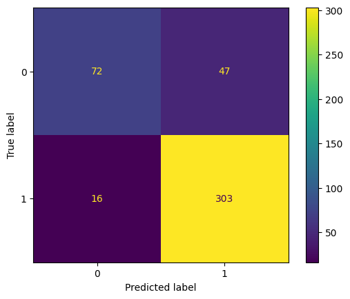
The classificaiton report shows that the model we went with achieved a precision of 85%, recall of 86%, f1-score of 85% and accuracy of 86%. These are all pretty good scores. The difference in metrics between predicted rainfall and predicted no rainfall do confirm that the model is better at predicting rainfall than the absence of it.
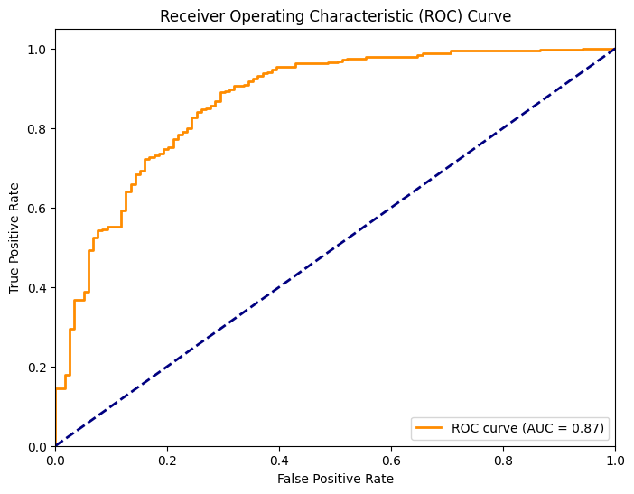
Finally let's calculate predicition probabilities on the validation dataset using our model and display the roc-auc curve. The roc_curve() function is used to compute the false positive rate (FPR) and true positive rate (TPR) at various threshold settings. The auc() function is then used to calculate the area under the ROC curve (ROC-AUC), which is a measure of the model's discriminative ability. As we can see, the model is much better than a random guessing one (blue line) but the ideal model would have an even sharper curve in the beginning. This chart confirms our observation from before that our model is not perfect to limit false positives.
4. Predicting on the test set
After all this work we can go ahead and use our model to predict on the test dataset. It is not a perfect model but it is pretty good for now. We could (and should) iterate with adding or removing some features and engineering some new ones. For now we will use it to predict on the left out test dataset. The resulting file is available on my repository.
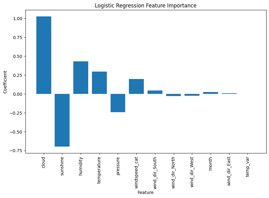
5. Bonus - Relative feature importance
We can plot the relative feature importance chart showing the main metrics that had an influence on model training and fitting and their relative strength. As shown here, cloud coverage and sunshine (negatively closely related) are the biggest preictors. Humidity, temperature and pressure, also correlated follow. Our categorical engineered features, as well as the month and temperature variation, did not seem to have a high importance.